🎨 Color drenching is the bold, vibrant trend that’s taking the interior design world by storm. This daring technique involves saturating an entire space in a single hue, creating a striking and cohesive look that’s sure to turn heads.
But before you grab that paintbrush, there’s more to color drenching than simply picking a shade and going wild. 🖌️
Understanding Color Drenching
Definition and Concept
Color drenching is a bold and immersive interior design technique that involves using a single color or closely related hues throughout an entire space. This approach goes beyond traditional accent walls, embracing a more maximalist aesthetic by applying the chosen color to walls, ceiling, trim, and even furniture. The result is a striking, cohesive look that envelops you in a rich, atmospheric environment.
Benefits for Modern Interiors
Color drenching offers several advantages for contemporary homes:
- Creates a sense of unity and flow
- Enhances the perception of space
- Adds depth and dimension to rooms
- Provides a dramatic backdrop for artwork and decor
- Allows for creative expression and personalization
By embracing this technique, you can transform ordinary spaces into extraordinary ones. Color drenching can make small rooms feel larger and cozier, while adding a touch of luxury to larger areas. It’s an excellent way to showcase your personality and create a memorable impression on guests.
Difference from Traditional Color Schemes
To better understand how color drenching differs from conventional approaches, let’s compare them:
| Aspect | Traditional Color Schemes | Color Drenching |
|---|---|---|
| Color Usage | Multiple colors in a room | One dominant color or closely related hues |
| Application | Walls only, with contrasting trim | Walls, ceiling, trim, and sometimes furniture |
| Visual Effect | Defined boundaries and contrast | Seamless, immersive experience |
| Focal Points | Created through color differences | Achieved through texture and subtle variations |
| Mood | Varied, based on color combinations | Intense, focused atmosphere |
While traditional color schemes rely on the interplay of different hues to create interest, color drenching harnesses the power of a single shade to make a bold statement. This technique challenges the conventional wisdom of using white ceilings and trim, instead embracing a more holistic approach to color application.
You’ll find that color drenching can be particularly effective in modern homes, where clean lines and minimalist design elements provide the perfect canvas for this dramatic technique. By enveloping a space in a single hue, you create a sense of continuity that can make even the most eclectic mix of furniture and decor feel cohesive.
As you consider implementing color drenching in your home, it’s important to remember that the key to success lies in choosing the right color palette. The shade you select will set the tone for the entire space, influencing everything from the mood of the room to how you and your guests feel within it. With this understanding of color drenching, you’re now ready to explore the exciting world of color selection and begin transforming your living spaces into vibrant, immersive environments.

Choosing the Right Color Palette
Now that you understand the concept of color drenching, it’s time to select the perfect palette for your space. This crucial step can make or break your color drenching project, so let’s dive into the key factors you need to consider.
Analyzing Room Size and Natural Light
The size of your room and the amount of natural light it receives play a significant role in choosing your color palette. Consider these factors:
- Room size: Darker colors can make a large room feel cozier, while lighter shades can open up smaller spaces.
- Light exposure: Rooms with ample natural light can handle bolder, darker hues, while spaces with limited light benefit from brighter, more reflective colors.
Here’s a quick guide to help you match colors with room characteristics:
| Room Characteristic | Recommended Color Choices |
|---|---|
| Small with low light | Light, cool tones (e.g., pale blue, soft green) |
| Small with bright light | Mid-tone warm colors (e.g., peach, yellow) |
| Large with low light | Rich, deep hues (e.g., navy, forest green) |
| Large with bright light | Any color, including bold and dark shades |
Considering Existing Furniture and Décor
Your color palette should complement your existing furniture and décor. Here’s how to approach this:
- Identify dominant colors in your current setup
- Choose a color that harmonizes with these existing elements
- Consider using a color wheel to find complementary or analogous colors
- If redecorating entirely, select your color palette first, then choose furniture to match
Exploring Color Psychology
Colors can significantly impact mood and atmosphere. When selecting your palette, consider the emotional responses different hues can evoke:
- Blue: Calming and serene, ideal for bedrooms or bathrooms
- Green: Refreshing and natural, great for living areas or home offices
- Yellow: Energizing and cheerful, perfect for kitchens or dining rooms
- Red: Stimulating and passionate, suitable for social spaces or accent walls
Testing Samples and Swatches
Before committing to a color, it’s crucial to test it in your space. Follow these steps:
- Obtain large color swatches or paint samples
- Apply them to different walls in your room
- Observe how the colors look at various times of day and under different lighting conditions
- Live with the samples for a few days to ensure you’re comfortable with your choice
Remember, color drenching involves using the same or similar hues throughout the space, so your chosen palette will have a significant impact. Take your time with this process to ensure you select colors that you’ll love living with day in and day out.
As you finalize your color palette, you’ll be ready to explore specific color drenching techniques that will bring your vision to life. These techniques will help you transform your space into a cohesive, eye-catching masterpiece that reflects your personal style and the mood you want to create in your home.

Color Drenching Techniques
Now that you’ve chosen your perfect color palette, it’s time to dive into the exciting world of color drenching techniques. These methods will help you transform your living spaces into bold, cohesive, and visually striking environments.
Monochromatic Approach
The monochromatic approach is the cornerstone of color drenching. You’ll use varying shades and tints of a single color throughout your space. This technique creates a harmonious and sophisticated look that’s both dramatic and soothing.
To execute this technique:
- Choose your base color
- Select lighter and darker versions of the same hue
- Apply these variations to walls, ceiling, trim, and furniture
For example, if you’ve chosen a deep navy blue, you might paint your walls in the main shade, use a lighter sky blue for the ceiling, and incorporate darker navy accents in your furnishings.
Tonal Variations
Tonal variations take the monochromatic approach a step further. You’ll work with colors that share the same undertone but may be from different color families. This technique adds depth and interest to your space while maintaining a cohesive look.
Consider this color combination for a tonal variation approach:
| Base Color | Tonal Variations |
|---|---|
| Sage Green | Olive Green |
| Celadon | |
| Moss Green |
Complementary Color Accents
While color drenching focuses on a dominant hue, adding complementary color accents can create striking visual interest. Use the color wheel to find the hue opposite your main color, and incorporate it sparingly for maximum impact.
Tips for using complementary accents:
- Use the 80/20 rule: 80% dominant color, 20% accent color
- Incorporate accents through artwork, throw pillows, or small furniture pieces
- Choose a muted version of the complementary color for a sophisticated look
Texture Play Within the Chosen Hue
Texture is your secret weapon in color drenching. By varying textures within your chosen color palette, you’ll add depth and dimension to your space without compromising the cohesive look.
Incorporate texture through:
- Fabrics (velvet, linen, wool)
- Wall treatments (textured wallpaper, plaster finishes)
- Furniture materials (wood grain, metal finishes)
- Accessories (woven baskets, ceramic vases)
Balancing Warm and Cool Tones
Even within a single color family, you can play with warm and cool tones to create balance and interest in your color-drenched space. This technique is particularly effective in rooms that receive varying amounts of natural light throughout the day.
Here’s how you can balance warm and cool tones:
| Warm Tones | Cool Tones |
|---|---|
| Terracotta | Sage Green |
| Mustard | Teal |
| Coral | Periwinkle |
By incorporating these color drenching techniques, you’ll create a space that’s both bold and balanced, showcasing your chosen hue in all its glory. Remember, the key to successful color drenching is consistency and intention. As you move forward, you’ll learn how to apply these techniques to different rooms in your home, creating a cohesive and stunning living environment.

Room-by-Room Application
Now that you understand the basics of color drenching, let’s explore how to apply this bold technique in different rooms of your home. Each space presents unique opportunities to create stunning, immersive environments through strategic use of color.
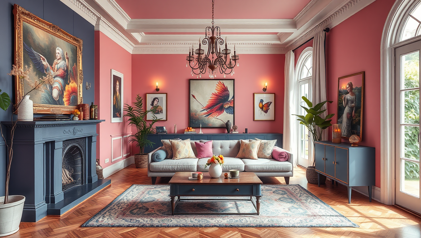
A. Living Room Color Drenching Ideas
Your living room is the perfect canvas for experimenting with color drenching. Here, you can create a dramatic and inviting space that sets the tone for your entire home. Consider these ideas:
- Choose a rich, saturated hue like deep teal or burgundy for walls, ceiling, and trim
- Extend the color to furniture pieces, such as sofas and armchairs
- Use varying shades of your chosen color in curtains, rugs, and throw pillows
Living Room Color Drenching Inspiration
| Element | Color Suggestion | Effect |
|---|---|---|
| Walls | Deep Teal | Cozy, sophisticated |
| Ceiling | Lighter Teal | Height and airiness |
| Sofa | Teal Velvet | Luxurious texture |
| Accents | Gold, Brass | Warmth and contrast |
B. Bedroom Tranquility Through Color
Your bedroom should be a sanctuary, and color drenching can help create a soothing atmosphere. Opt for calming hues that promote relaxation:
- Soft lavender or sage green for walls, ceiling, and bedding
- Incorporate texture through velvet curtains or a plush area rug in the same color family
- Add depth with subtle pattern play in throw pillows or wallpaper
C. Kitchen and Dining Area Vibrancy
Inject energy into your culinary space with vibrant color drenching:
- Bold yellow or coral for cabinets, walls, and even appliances
- Use a slightly lighter shade on the ceiling to create height
- Incorporate patterned tiles or a backsplash in complementary hues
D. Bathroom Spa-like Atmosphere
Transform your bathroom into a luxurious retreat with soothing color drenching:
- Choose a serene blue or soft green for walls, tiles, and fixtures
- Extend the color to towels, bath mats, and shower curtains
- Add natural elements like wooden accents or plants for balance
By applying color drenching techniques room by room, you can create a cohesive yet diverse color story throughout your home. Remember to consider the function of each space and how color can enhance your daily experiences. In the next section, we’ll dive into practical tips for executing your color drenching vision with confidence.

Practical Tips for Execution
Now that you’ve chosen your color palette and explored various techniques, it’s time to bring your color drenching vision to life. Let’s dive into some practical tips to ensure a smooth and successful execution of your bold color scheme.
Preparing surfaces for painting
Before you start painting, proper surface preparation is crucial for achieving a flawless finish. Here’s a step-by-step guide to get your walls ready:
- Clean the walls thoroughly to remove dust and grime
- Repair any cracks or holes with spackling compound
- Sand the walls smooth once repairs are dry
- Apply primer to ensure even coverage and better paint adhesion
- Protect floors, trim, and furniture with drop cloths and painter’s tape
Remember, taking the time to prepare your surfaces will result in a more professional-looking finish that truly showcases your color drenching efforts.
Selecting appropriate paint finishes
The paint finish you choose can significantly impact the overall look of your color-drenched space. Here’s a quick guide to help you select the right finish for each area:
| Paint Finish | Best for | Characteristics |
|---|---|---|
| Matte | Living rooms, bedrooms | Non-reflective, hides imperfections |
| Eggshell | Hallways, dining rooms | Slight sheen, easy to clean |
| Satin | Kitchens, bathrooms | Durable, moisture-resistant |
| Semi-gloss | Trim, doors | Highly reflective, very durable |
Consider using a mix of finishes to add depth and interest to your color-drenched room. For example, you might use a matte finish on the walls and a semi-gloss on the trim for a subtle contrast.
Incorporating colored furniture and accessories
To fully embrace the color drenching trend, extend your chosen hue beyond the walls. Here are some ways to incorporate your color scheme into furniture and accessories:
- Reupholster existing furniture in your chosen color or a complementary shade
- Add throw pillows, curtains, and rugs in varying tones of your main color
- Paint wooden furniture to match or complement your walls
- Display artwork that features your chosen color palette
- Use colored glassware or ceramics as decorative accents
Remember, the key to successful color drenching is creating a cohesive look while maintaining visual interest through subtle variations in tone and texture.
Lighting considerations for color-drenched spaces
Lighting plays a crucial role in how your color-drenched space will appear. Here are some tips to ensure your lighting enhances your bold color scheme:
- Utilize natural light: Position mirrors strategically to reflect and amplify natural light
- Layer your lighting: Combine ambient, task, and accent lighting for a well-balanced space
- Choose warm or cool bulbs: Warm bulbs enhance reds and yellows, while cool bulbs complement blues and greens
- Install dimmer switches: This allows you to adjust the mood and intensity of your color-drenched room
By carefully considering your lighting options, you can create a dynamic space that showcases your color drenching efforts at any time of day.
With these practical tips in mind, you’re well-equipped to execute your color drenching project with confidence. In the next section, we’ll explore the finishing touches that will truly bring your color-drenched space to life.

Finishing Touches and Styling
Now that you’ve embraced the bold color drenching technique in your home, it’s time to add those crucial finishing touches that will elevate your space from striking to stunning. Let’s explore how you can refine your color-drenched rooms with strategic styling elements.
Incorporating neutrals for balance
While color drenching is all about immersion in a single hue, incorporating neutrals can provide much-needed visual relief and balance. You don’t want to overwhelm the senses, after all. Here’s how you can introduce neutrals effectively:
- Use white or cream-colored trim to frame your color-drenched walls
- Add natural wood elements through furniture or flooring
- Incorporate tan or gray textiles in curtains, rugs, or throw pillows
Remember, the goal is to complement, not compete with, your chosen color scheme.
Adding metallic accents
Metallic accents can add a touch of glamour and depth to your color-drenched space. They reflect light and create interesting visual textures. Consider these options:
- Gold or brass hardware on cabinets and doors
- Silver or copper picture frames
- Metallic finish on light fixtures or furniture legs
| Metallic Finish | Best Paired With |
|---|---|
| Gold | Warm colors (reds, oranges, yellows) |
| Silver | Cool colors (blues, greens, purples) |
| Copper | Earthy tones (terracotta, sage, brown) |
Using artwork and decorative elements
Artwork and decorative elements are perfect for breaking up large color-blocked areas and adding personality to your space. Here are some ideas:
- Choose art pieces that complement or contrast with your main color
- Display decorative objects in varying shades of your chosen hue
- Incorporate patterned textiles that include your main color
- Use plants to add a natural element and break up the monochrome look
Creating focal points within the color scheme
Even in a color-drenched room, you’ll want to create focal points that draw the eye and add interest. Here’s how you can achieve this:
- Install a statement light fixture in a contrasting color
- Create an accent wall with textured wallpaper in a deeper shade of your main color
- Position a large mirror to reflect light and expand the space
- Use a bold piece of furniture as a centerpiece
By carefully considering these finishing touches, you can create a color-drenched space that’s not only bold and modern but also balanced and inviting. Remember, the key is to enhance your chosen color scheme without overpowering it. With these styling techniques, you’ll transform your color-drenched rooms into cohesive, eye-catching spaces that truly reflect your personal style and embrace the maximalist design trend.

Color drenching is a powerful technique that can transform your home into a vibrant, cohesive space. By embracing a single hue or complementary color palette throughout a room or your entire home, you create a bold and immersive atmosphere that reflects your personal style. Remember to choose colors that resonate with you and consider the mood you want to evoke in each space.
As you embark on your color drenching journey, don’t be afraid to experiment with different techniques and applications. Whether you’re painting walls, selecting furniture, or adding accessories, let your chosen color scheme guide your decisions. With careful planning and execution, you can create a stunning, modern home that stands out from the crowd and provides a truly unique living experience.